Saturday, August 31, 2013

I Found Some Pics With Better Light

British Dragoons


 Here is a look at some of my figures with better light. I just don't have the best lighting equipment for taking pictures, and a number of the pictures on the blog are a bit dark.
What the figs look like on a game table - British Line and British Light Infantry w/command

Portuguese Line

Thursday, August 29, 2013

Horse Hell

It has been such a long time since I have done much painting, that I forgot how to do a number of important things. Painting horses would be a prime example. I had to scroll through my own tutorials just to figure out what colors I used, how the paint was applied, and how much contrast to put in the colors being used.  I tried to paint a Palomino horse, which was a DISASTER. It looked like a horse-shaped banana, so it was scrubbed. I should never let so much time go by again, otherwise, I'll forget how to paint anything.  Even a barn. Wow.  I'll post pics of the Spanish command stand as soon as I remember what I do with horses.  As a great Hebrew man once said, "oy vey."

Tuesday, August 27, 2013

The Cazadores, Finished and Based


Well, here they are. This rounds out my Portuguese division for a great Arroyo dos Molinos scenario. Next, I'll be doing some command stands - Spanish, British, and British cavalry command.

Tuesday, August 20, 2013

Oops, I forgot an important detail!

Figure with successive layers on the right leg.

One important detail I forgot to mention in my post about folds and wrinkles in clothing is this: the best effect comes from successive passes of diluted paint! If one looks at the right leg (to your left as your are looking at it), you'll see softer transitions between the shade color and the highlight color. If done well, it will look like a wash, but it isn't a wash.  It's just a judicious use of paint, thinner, and a finely pointed brush. What I do is dip the brush in thinner (with acrylic paint, that would obviously be water), then dip in paint, and then make brush strokes accordingly. For major areas of a 15mm figure, this would take about 10 minutes per figure, which is why this technique isn't for everyone. If you like the style, that's how it is achieved.  Happy painting!

Sunday, August 18, 2013

AB British Dragoons

Not much to say, just a few pics.


Saturday, August 17, 2013

Wrinkles in Clothing - Step by Step

Wrinkles in Clothes – Step by step.

A while ago, someone asked me to post a step-by-step on how I paint clothing wrinkle and crease patterns on 15mm figures. Well . . . here it is.  Finally.

Once you see how this is done, you’ll realize that anyone could paint figures like this. One big drawback is that it is so slow, that painting an army for gaming would take a long, long time. Then again, when one gets as bored as me, you really won’t care.  If I were painting for gaming, with a deadline, the style would be considerably loosened, just to have enough figures to use for a game. Not only that, but when these figures are on a game table, no one would notice details like wrinkles in clothing. Therefore, it isn’t for everyone, but if you like the style, it isn’t that tough to do, if you have the right equipment and patience to pull it off.


The first thing to consider is the equipment you have. There are a few things that come in very handy, especially given the small scale.  The first is some sort of optical aid – here is a picture of mine, a pair of OptiVisor binocular magnifiers. The binocular part is really important; if you just took a magnifying glass, or light with a magnifier on it, you’d lose depth perception, which is essential. By magnifying both eyes independently, you can see not just the figure better, but you can see the contours sculpted into it, and you can tell where your brush meets the figure. I think these are 5x. I used to paint without optics, but you can go blind that way.  Not the way my mother thought I’d go blind . . . 


Another useful tool is something to hold your figures steady at various angles. One hand can be shaky enough; two hands are doubly shaky. Therefore, I have these weighted clamps that can be used to hold the figures. This helps a lot. I think these clamps can be found in almost any decent hobby shop – I bought this at a HobbyUSA store.


An item that is not to be without is a good paintbrush. I’ve found that it is impossible for me to paint in the style I paint without just the right paintbrushes. These two are sizes 00 and 10/0, but more important than the size is the sharp point at the end. You’ll see why in a minute. Suffice to say that without the right paint brush, painting details like folds in clothing is a non-starter.


The last big consideration is the figure manufacturer. Lately, I’ve been using AB figures because they are so well sculpted. For wrinkles in clothing, it’s hard to find a better brand. Most of the major wrinkle and fold patterns are sculpted into the figure – subtly but enough to notice. Other brands are o.k., like Warmodelling or Old Glory – but with either of them, the features of the figures are exaggerated in a way that makes them look great from a distance, but not so much when up close and personal.


For this demonstration, I’ll be painting Portuguese Cacadores (I need a battalion for my Arroyo scenario). Again, the manufacturer is AB, which always turn out nicely.  The first thing to do is to paint the major clothing areas with your base color.  The Cacadores wore brown uniforms that faded to tan after time. I painted the base color with Vallejo Flat Brown (70984). The next thing to do is choose the highlight color (I only use two tones on 15mm figures). In this case, I have Delta Ceramcoat Raw Sienna (02411).  You’ll want enough contrast between the dark and light colors to see the detail, but not so much contrast that you paint a cartoon. I always start with the delicate stuff first with the small brush (10/0), dipped in water and rolled to a very sharp point. It is important not to dip the brush too far into the paint – just enough to put a little paint on the brush. Then I roll the brush one or two rotations on a palate to make sure that the point of the brush still goes down to just about the last hair.


Basic background color painted on the figure's clothes.

One shouldn't sink the brush too far into the paint. That will eventually ruin the brush and keep you from achieving fine detail.

Brush rolled a couple times to sharpen the point.

A comparison between the shade color and the highlight color. There's contrast enough to make a nice figure without being too contrasted.

I usually start by doing the intricate parts first with the small brush. This includes the crinkles in the pants around the athletic cup, bends in knees, and elbows. At this point, the figure isn’t anything to write home about.  In fact, Martha Stewart would have a cow.


When doing tricky wrinkles like the inside of the elbows, I usually give it a very light touch with the point of the brush, then add pressure as the brush moves away from the center of the crease. Most of these types of folds are triangle shaped, and you can achieve a good sharp point to the triangle on the inside of the arm this way.

Here I have a couple of the minute details done. I use the bigger brush for the larger areas.


After that, I use the bigger brush (still with a sharp point on it, though) to fill in the bigger parts (thighs, back of legs, back of arms where the tension of the arm in the uniform doesn’t leave creases or wrinkles.

If you don’t like what you have, you can touch the whole thing up in reverse. Just take the small brush with a fine point, and add wrinkles with the shade color. You could do this forever, but really what you want to do is leave soft and subtle changes in shade in the shape of the wrinkles of the clothes.


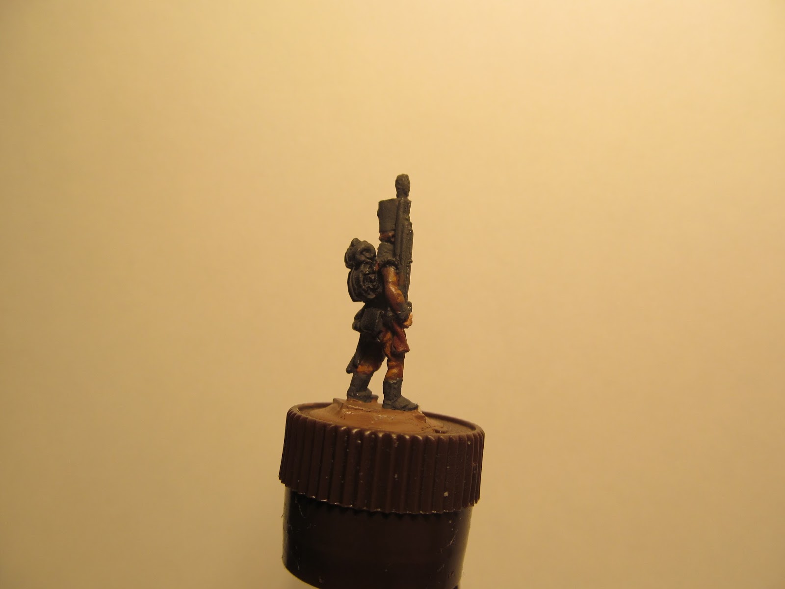
Then, as an aside, I’ll paint the tunic between the strips of piping.  This is the secret to painting piping and lace – turn the figure on its side so that you are using the brush vertically. Why? The muscles of the hand operate differently when you use a vertical stroke versus a horizontal stroke. I think you’d be amazed at the accuracy of your brush strokes just using this simple trick. If you make a slight boo-boo, you can just paint over it with the piping base color (in this case, black). That way when you highlight the piping, you can just let the very tip of the small brush ride along the raised contour of the piping, leaving what appears to be an impossibly small strip of piping. In this case, I use Vallejo Dark Gray (70994) to highlight black on the figure, including the piping.

Figure held sideways to allow for vertical brush strokes while doing the
piping.

The same figure with the piping and belts highlighted.

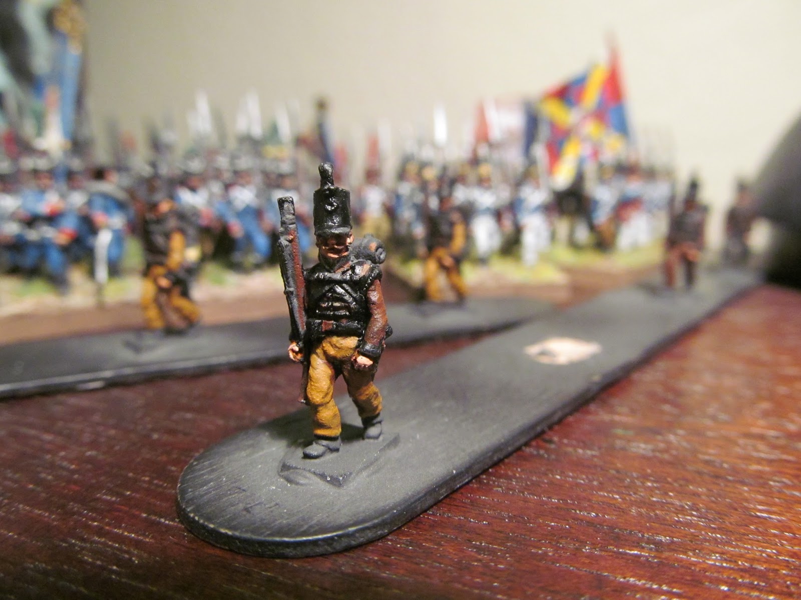
A finished figure, ready to be mounted.

And that's it. It's enough to keep the hobby challenging, but without going batshit crazy. Below you can see a pic that this guy fits in o.k. with his line infantry comrades. Happy painting!  BTW, I'd like to see your stuff, too. If I could figure out how to have you put your stuff on here, I think that would add to the quality of my blog. Best wishes!

A Cacadore next to the line infantry.


Friday, August 16, 2013

Cross-blogging

I found another 15mm figure painter who paints in the same style. As with me, our techniques have changed over time.

http://napoleonicsinminiature.blogspot.com/search/label/15mm%20Prussians


Sunday, August 04, 2013

Hello all:

I was thinking of loosening up my painting style. I've seen Scott MacPhee's blog, "MacPhee's Miniature Men, which is impressive. That got me to thinking - most of the detail I spend my time painting would NEVER be noticed on a game table. Let's face it; at 15mm, you'd never know whether every button was painted. Unless your eyes are natural macro lenses, no one really cares about pristine details.


Just thinking out loud. What do you think?

Here's the link to Scott's blog:

MacPhee's Miniature Men

Monday, July 01, 2013

Piping and Lace - Simple Procedure


As promised (a couple YEARS ago), this is the article on painting piping and lace in 15mm.  For this posting, I’m using the British Foot Guards from the peninsular campaign.  The figures pictured are from AB, a brand that I am slowly beginning to embrace as much as Old Glory 15s. 

The pictures in this entry assume that one had already primed the figure with some sort of figure primer or paint.  Here we have a black undercoat being used, and the very first step I usually take is to paint the faces and hands with shade and highlight colors.  This is because as Ian Marsh wrote, it “gives personality” to the figures.

After painting the flesh areas, I proceed to shade the areas of the piping color.  In this case, the battalion in question is the British Foot Guards from the Peninsula, so I pick a reasonable shade color for white, which is the piping and lace color.  Any sort of gray will do.  Here, I’ve used Vallejo #821, German Camouflage Beige (picture #1).  The areas shaded do not include the fine piping or lace that should be painted, only the larger areas of the same color.


The next step is to paint the piping and lace colors – in this case, white. The key is to paint the areas of piping and/or lace that would be smaller than other colors on the figure.  So, the idea is to paint the piping color (in this case white) in a way that is careful, but not necessarily too tight because any white that is overplayed can be covered up by shade colors of the areas in question.  Since most of the shade areas are red, and painting a maroon color over white leaves a weird sort of bright maroon color, which just doesn’t look right, I outline the white lace/piping colors with an opaque black (picture 2).


The whole secret to painting sharp piping and/or lace on a 15mm figure is to have a brush with an exceptionally well defined point to it. Then use that point with shade color (this example uses the black undercoat color) to make the narrow lines that give the detail. For example, the piping at the bottome of the figure’s coat looks like an impossibly small line – which it almost is. What I did was paint the line, using the point of the brush to follow the contour of the coat, then use the point of the brush above and below the line with black to give it the extra fine quality to it. The finished figure is in the battalion of Foot Guards, shown below.


Here's a closeup of a company of similar figures, finished and based.


Tuesday, March 22, 2011

AB - Battle Honors Comparison


After yet another waaaaaayyy to long of time away, I wanted to post something regarding a comparison between AB figures and Battle Honors. I've seen some people trying to sell Battle Honors figures as AB figures, which is not entirely accurate. The do have the same sculptor, Tony Barton (Anthony Barton, ergo the "AB"), but are entirely different product lines.

I like both; they have the same general style, but the craft and the hobby had progressed considerably between the Battle Honors and AB lines. Probably the biggest difference one is likely to see is the size differential. Battle Honors are true 15mm figures, while the AB figures are closer to 18mm, and the difference is easily seen when the figures are side by side, so I've posted some pictures.

In the pictures, the Portuguese figures (guys with blue jackets) are AB figures, and the Spanish figures (guys with white coats) are Battle Honors. The similarity in style is obvious; however, the manufacturing and product lines are different. Rather than waxing on about 15mm figures, I'll just let you look at the figures and make your own assessment. Really, no one would notice the difference on the game table if you have consistent units - that is you don't mix the figures within the same unit. Devil's argument for that is that anyone who has been in military service will tell you that we all fall out according to height - ergo there are tall and short people in the same formation, so mixing them just make them look more like real people. I guess it's up to the gamers' taste, but style-wise, they are very similar. FYI . . .

Saturday, February 06, 2010

Wrinkles in 15mm - some pics


Some pics here should illustrate the general concepts of the wrinkles noted in the previous post. I picked a few figures of 15mm Spanish figures from Battle Honors and AB (white and yellow coats make the patterns more recognizable), and in due fairness, some of the clothing folds are sculpted into the figs. I've posted both infantry and cavalry figures, although the folds are going to be very similar. Most of the folds are not sculpted, which should demonstrate the fact that if one wishes, the folds can be painted in instead.

For really fine work, like the inside of the knees and elbows, I use a size 00 brush with an extremely fine point on it. I carefully drag the brush from the inside of the knee/elbow out, allowing just the very tip to drag and make a sharp "V" to the knee/elbow joint. The rest of the sleeve or pant is painted so that the color is more or less solid in the stressed part of the fabric (the anterior of the leg, posterior of the arm), and the wrinkled part is painted in in a more or less diagonal fold pattern. If anyone is interested, I could do a step by step, but until then, these pictures should show the general idea. Happy painting!